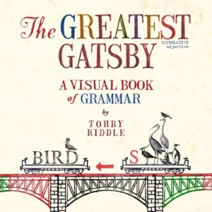
The Greatest Gatsby
Category
Books, Books Currently AvailableAbout This Project
As pictures are remembered better than words, this book explores the fundamentals of grammar as visual information.
Introducing a new, visually engaging way of presenting grammar. Appealing to the senses and the emotions with colour, texture, humour and drama, this book seeks to make the subject of grammar not only more intelligible to more people, but more memorable.
FROM THE AUTHOR
The Greatest Gatsby: a Visual Book of Grammar was created with the goal of turning the fundamentals of grammar into visual information. While working on the illustrations for The Word Spy books (written by Ursula Dubosarsky), I became increasingly interested in the degree to which verbal or abstract ideas could be presented visually. Not as illustrated text but as visual information – where the image is the text! I felt that this might actually be the most optimal way of presenting this subject, especially as there seemed a history of problems with making the information ‘sticky’ to a reader when presented conventionally in black type on white paper.
It begged the question, why does so much information look the same? No matter how much subject matter differs, it is all presented the same way, in black type on white paper. And with little or no regard for when or where a page-break occurs. Does it have to?
The subject of grammar, seemed to be a good challenge. How would one represent elusive and complex verbal ideas visually?


